A dash of urban photography

Lord Farquad

New member
Having recently being medically retired from work I’m try to learn photography as a hobby. The Jag is my inspiration.
 

Attachments

  • 26632EAD-FA32-426C-B294-BA3622E20A17.jpeg
    26632EAD-FA32-426C-B294-BA3622E20A17.jpeg
    2.1 MB · Views: 2,302
  • IMG_0610.jpeg
    IMG_0610.jpeg
    6.7 MB · Views: 2,302
  • 3939B3ED-2AEE-4497-9469-9627FD76776A.jpeg
    3939B3ED-2AEE-4497-9469-9627FD76776A.jpeg
    3 MB · Views: 2,302
  • IMG_0615.jpeg
    IMG_0615.jpeg
    5.6 MB · Views: 2,302
  • 26632EAD-FA32-426C-B294-BA3622E20A17.jpeg
    26632EAD-FA32-426C-B294-BA3622E20A17.jpeg
    2.3 MB · Views: 2,302
A Cannon 4000D with a EF 55-250 IS2 Lens. Then edited using LightRoom. I like them, but love to hear from others if they think they’re good too.
 
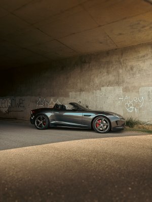
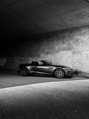
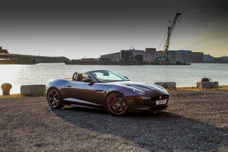
This one at the docks I really like. Great tone, and the angles lead in to the car.
Photoshop that bird by the crane to the left of the frame (that's allowed cheating IMHO).

I'd suggest playing with the "1/3 rule" in terms of cropping for some shots, but all rules are there to be broken (as new Jaguar might say!)
 
Some very nice photos and good locations. Having a very similar colour and the same wheels might make me biased :)

I used to spend a lot of time photographing cars with decent kit SLR camera, lenses, etc., but my patience and the current iPhone pro cameras are so good that I don't bother and just snap away :(

I agree with pirateprentice and would consider the rule of thirds in your pictures and possibly the car placing on the intersection lines.
Personal only but I also think the red is too intense on the 3rd and 4th shot and distracts.
 
I'd put the crane about 1/3rd in from the right and crop off the oversaturatured light on the water on the left. Crop it about where the rectangular block ends. I'd lighten the shadows at the bottom as well just to lift the visibility of the car a little more. Also you have some specs of dust on the lens or sensor around the crane (those little black circular smudges) so use the photoshop spot removal tool to take those out and clean up the sky. The gradient you've added at the top is maybe a tad harsh, try a little bit less or even a slight vignette on the corners as well.

The red is very overdone in the top pics but the shot layout is nice. Less is more. The best of the lot is the black and white one.
 
Back
Top